
Pantone is iconic when it comes to color – they’re widely regarded in design, from graphic design to interiors. So it’s no wonder that every new year we look forward to finding out what Pantone has chosen for their color of the year.
According to Pantone, color “has always been an integral part of how a culture expresses the attitudes and emotions of the times”. We couldn’t agree more.
Pantone has declared a color of the year for every year since 2000. For their 22nd Pantone Color of The Year pick, they chose a dynamic periwinkle blue colour with a violet red undertone – Very Peri.
Veri Peri represents a new perspective, while being a symbol of global transition that we are currently facing. This year’s Pantone colour illustrates the combination of modern life and colour trends in the digital world and is a nod to the metaverse and digital art.
“The Pantone Color of the Year reflects what is taking place in our global culture, expressing what people are looking for that color can hope to answer.” added Laurie Pressman, Vice President of the Pantone Color Institute. “Creating a new color for the first time in the history of our Pantone Color of the Year educational color program reflects the global innovation and transformation taking place. As society continues to recognize color as a critical form of communication, and a way to express and affect ideas and emotions and engage and connect, the complexity of this new red violet infused blue hue highlights the expansive possibilities that lay before us”.
– Leatrice Eisman, executive director of the pantone color institute
Veri Peri brings feelings of joy, creativity and imaginative expression to the world.
We’ve rounded up our favourite art picks inspired by the vibrant color of the year!
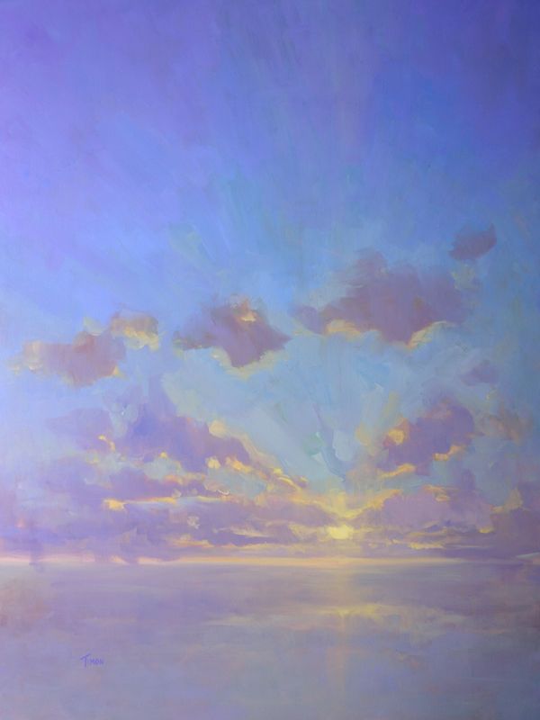
Cloudscape in Purples by Timon Sloane
Painting, Oil on Canvas
A word from the artist:
“I paint to explore and interpret the unique beauty found within particular moments in time. A subject might be grand like a vivid sunset or a crashing wave.”
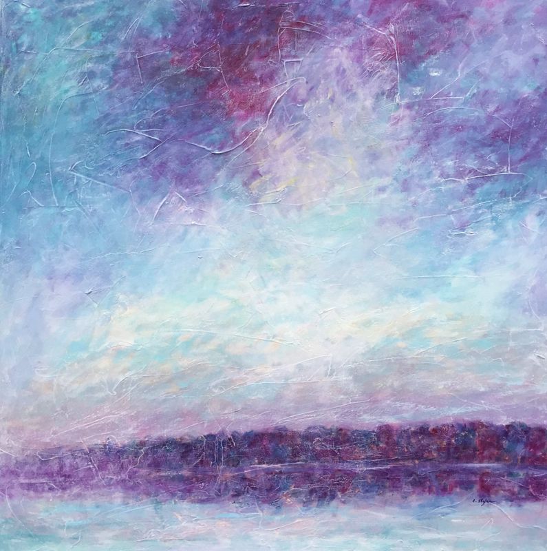
Purple Sunset by Cristina Stefan
Painting, Acrylic on Canvas
A word from the artist:
“A moment of quietness… No sounds, no movements … no breath. Reflections in the water… I impregnate myself of this unique moment where nature is the decor and the performer. ”
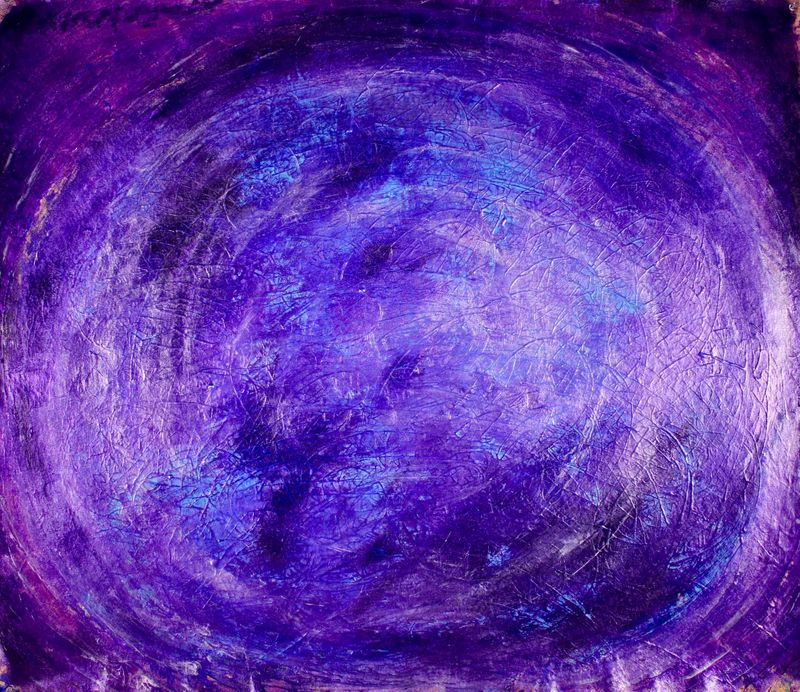
Vortex in Purple by Nestor Toro
Painting, Acrylic on Canvas
A word from the artist:
“I create art that transports the viewer to a mental landscape of contemplation. One of my biggest influences is travel. Travel opens up your mind and frees the imagination to new experiences. Getting lost in a huge city and exploring. Nature and organic movement such as smoke, water, magnetic fields, even the global migration of animals and the way birds and fish move in unison influence me. Chaos theory and time itself are all influences on my mental process when working on a painting.”
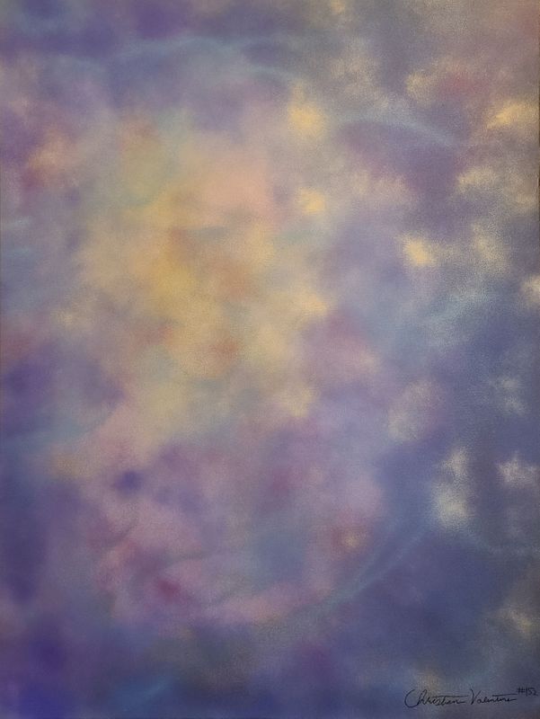
Purple love by Christian Valentine
Painting, Acrylic on Canvas
A word from the artist:
“Calming and beautiful. Dreamy cloudiness and soothing interplay of colors. Hints of teal tickle your imagination. Hand painted.”
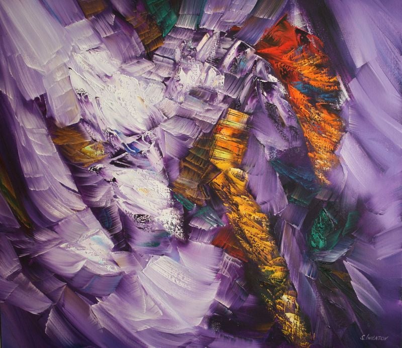
Purple echo 2 by Sergei Inkatov
Painting, Oil on Canvas
A word from the artist:
“Painting is one of the best human inventions because it allows one to present the entire world in a single painting. ”
–
Explore our curated collection of art from top artists around the world! Need help finding the perfect piece of art for your home? Enjoy our complimentary art advisory service.
Comments (0)